
Importance of Color in Stylish Living Rooms
Importance of choosing the right color palette
In creating stylish living rooms, it is crucial to select the right color palette. The choice of colors sets the tone for the entire room and can significantly impact the overall aesthetic. By carefully choosing colors that complement each other, one can create a harmonious and visually appealing space that exudes warmth and elegance. Picking the right shades can transform a room from ordinary to extraordinary, making it a welcoming and comfortable place for relaxation and socializing.
Impact of colors on mood and ambiance
The impact of colors on mood and ambiance cannot be understated. Soft and soothing colors like blues and greens can create a calming atmosphere, perfect for unwinding after a long day. Bright and vibrant hues, on the other hand, can inject energy and excitement into the room, making it a lively space for entertaining guests. Carefully considering the psychological effects of each color can help in creating a living room that not only looks stylish but also uplifts the spirits of those who spend time in it.
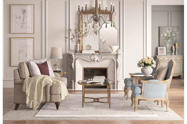
Neutral Living Room Color Schemes
Benefits of neutral color palettes
When designing stylish living rooms, opting for neutral color palettes can offer numerous advantages. Neutral colors such as whites, grays, and beiges provide a timeless and sophisticated backdrop for any decor style. They create a sense of tranquility and balance, lending a calming influence to the space. Additionally, neutral hues make rooms appear more spacious and can easily adapt to changing trends and accessories, ensuring longevity in design choices. They also serve as a versatile foundation for incorporating pops of color through furniture and decor elements, allowing for flexibility in personalizing the space.
Popular neutral colors for living rooms
| Color | Description |
|---|---|
| White | A timeless and classic choice that brightens up the room. |
| Gray | An elegant and versatile option that pairs well with various accents. |
| Beige | A warm and inviting color that adds coziness to the living space. |

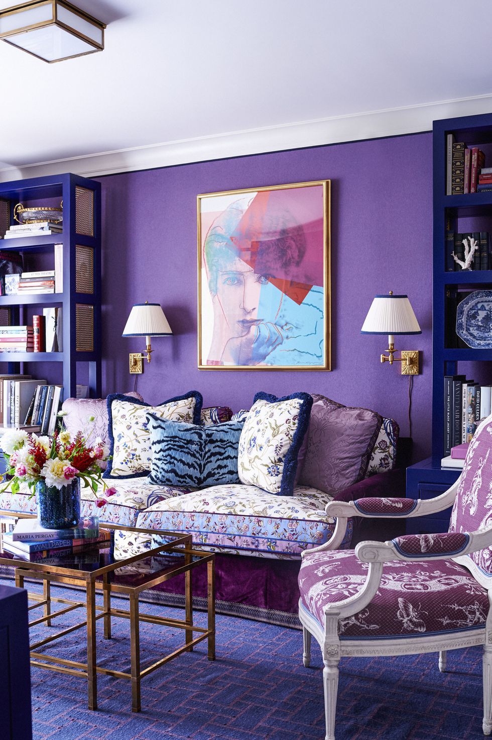
Bold and Vibrant Living Room Colors
Advantages of using bold and vibrant colors
Exploring bold and vibrant colors in living room decor can bring a sense of energy and personality to the space. These colors add a lively touch and can evoke feelings of happiness and positivity. Unlike neutral tones, bold colors make a statement and create a visually striking impact in the room, making it a vibrant and dynamic setting for gatherings and relaxation. Incorporating bold hues can also showcase the homeowner’s unique style and design preferences, injecting a sense of playfulness and creativity into the living environment.
How to incorporate bold colors tastefully
When incorporating bold colors into living room decor, it is essential to find a balance that complements the space without overwhelming it. Opt for bold accents through pillows, artwork, rugs, or accent walls while keeping the main furniture pieces in neutral tones. Experiment with different color combinations that harmonize well, ensuring a cohesive and visually appealing look. Additionally, consider the natural lighting in the room to enhance the vibrancy of bold colors without creating a dark or claustrophobic atmosphere.

Pastel and Soft Tones for a Serene Living Room
Benefits of pastel and soft color tones
Embracing pastel and soft tones in a living room can bring a sense of tranquility and calmness to the space. These colors create a serene atmosphere that promotes relaxation and rejuvenation, making it an ideal setting for unwinding after a long day. Unlike bold hues, pastel tones offer a subtle and sophisticated elegance that can make the room feel airy and light. The soft colors also have a soothing effect on the mind, helping to reduce stress and create a peaceful ambiance in the living area.
Creating a relaxing atmosphere with pastel colors
When incorporating pastel and soft tones into living room decor, it is important to focus on creating a cohesive and harmonious palette. Opt for soft hues in furniture, drapery, and accessories while adding texture through fabrics and materials. Consider layering different shades of pastels to add depth and dimension to the room without overwhelming the senses. By strategically placing accent pieces and incorporating natural elements, such as plants or natural light, the living room can become a tranquil sanctuary for relaxation and comfort.

Monochromatic Living Room Palettes
Definition and benefits of monochromatic color schemes
Embracing monochromatic color schemes in a living room entails sticking to variations of a single color. This approach offers a sense of cohesion and simplicity, creating a visually pleasing and harmonious space. By using different shades, tints, and tones of the same color, a monochromatic palette adds depth and interest without overwhelming the room. This style choice can evoke a sense of sophistication and modernity, making the living room feel polished and well-designed.
Tips for using monochromatic palettes effectively
When incorporating a monochromatic color scheme, it is essential to play with different textures, patterns, and finishes to add visual intrigue. Consider using accents in metallic or reflective surfaces to introduce contrast and dimension. Utilize varying levels of saturation and lightness within the chosen color to create a dynamic and layered look. By carefully balancing elements and incorporating elements of interest, a monochromatic living room can exude elegance and style effortlessly.

Complementary Color Combinations
Exploring complementary color wheel combinations
When delving into complementary color combinations for a living room, individuals can explore pairings that sit opposite each other on the color wheel. This creates a vibrant and dynamic visual impact as the colors enhance each other, making them appear brighter and more intense. By utilizing complementary colors such as blue and orange, or purple and yellow, a sense of balance and energy can be achieved within the space. This approach allows for versatility in design choices while ensuring a cohesive and engaging aesthetic.
Contrast and harmony in complementary color schemes
One of the key advantages of utilizing complementary color schemes in a living room is the striking contrast they offer. The pairing of opposing hues creates a lively atmosphere while maintaining a harmonious balance. Through careful placement and proportion, individuals can bring a sense of drama and sophistication to the space, making it visually stimulating and inviting.
Analogous Color Harmony in Living Rooms
Explanation of analogous color schemes
When exploring interior design options in a living room, individuals may consider utilizing analogous color schemes. This approach involves selecting colors that are adjacent to each other on the color wheel, creating a sense of harmony and cohesiveness. Analogous colors such as green, yellow, and yellow-green can evoke a peaceful and soothing ambiance within the space. By blending these colors in varying shades and tones, a warm and inviting atmosphere can be achieved, promoting a sense of unity and balance.
Creating a cohesive look with analogous colors
Utilizing analogous colors in a living room design enables individuals to create a cohesive and visually appealing look. By incorporating colors that share similar undertones and harmonize well together, a sense of continuity and fluidity is established throughout the space. This design approach allows for flexibility in mixing and matching different hues within the same color family, resulting in a welcoming and harmonious environment that exudes charm and elegance.

Triadic Color Palettes for a Playful Vibe
Understanding triadic color relationships
When considering interior design concepts in a living room, one may explore the use of triadic color palettes to infuse a space with vibrancy and playfulness. Triadic colors are evenly spaced around the color wheel, creating a dynamic and lively visual impact. Combining hues like red, blue, and yellow can lead to a spirited and energetic ambiance within the room. These colors work harmoniously together, adding a cheerful touch to the decor.
Balancing multiple colors in a triadic palette
Harmonizing multiple colors in a triadic palette allows for a well-balanced and engaging look in a living room setting. By carefully blending primary colors in varying intensities and shades, individuals can achieve a vibrant and joyful atmosphere. This approach offers versatility in experimenting with different color combinations while maintaining a cohesive and lively aesthetic throughout the space.
:strip_icc()/modern-black-white-living-room-shelf-wall-32a939f1-3714339a75ec47599537691e944764ae.jpg)
Conclusion
Summary of living room color palette options
The use of triadic color palettes in a living room design can create a vibrant and energetic atmosphere. By strategically combining colors like red, blue, and yellow, a playful vibe can be achieved, adding cheerfulness to the space.
Inspiration for choosing the perfect colors
Exploring triadic color relationships provides inspiration for selecting the perfect hues that harmonize beautifully. Balancing multiple colors in a triadic palette allows for a dynamic yet balanced look, fostering a joyful ambiance in the living room.
0 Comments